Collateral.. the Good Kind
- Chanté Sexton

- Oct 7, 2019
- 2 min read
In my previous blog post, I briefly discussed some of the basic do's and don't's for creating a clean, professional business card. However, working for a business or organization typically requires much more than arranging a single contact card. Rather, additional collateral material is needed to represent your organization's brand.
Because of my decision to work with Second Chance Animal Sanctuary Norman as my client, it was important that I create a business card, letterhead and envelope to capture the nonprofit's brand. Second Chance's voice is on the more playful side. Additionally, the nonprofit's mission to help pets find their "forever homes" was something I wanted to emphasize.
If I had to select one word to describe collateral material, it would be cohesion. It's evident through my three designs that the main color for Second Chance is white. Furthermore, the presence of small paw prints, and even a dog house, makes it clear what this nonprofit's field is and what it endeavors to accomplish.
In terms of the actual design process, great care had to be taken when combining certain elements. My first letterhead draft included black type against a red background. After it was brought to my attention that this would not translate to print well, I switched to white, instead.
I've also come to realize that it's the little details that really pull a design together. The first draft of my business card was especially rough. I struggled with the placement of text, especially in relation to the nonprofit's logo. Nonetheless, I was able to produce a final draft (pictured below) that's more in line with what I envisioned from the start.
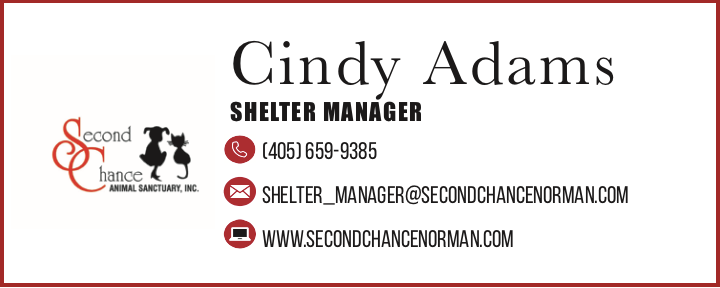
The three icons used to represent call, e-mail, and Second Chance's website are what gave the card a more professional look. Throwing in minute graphics, when appropriate, adds dimension where it was otherwise lacking. This also makes it less difficult for individuals to locate information quickly.


The envelope (pictured directly above) was simpler to create, but, again, I wanted to accurately convey the fun-loving energy that Second Chance is so well-known for. The nonprofit's logo on the front gives a clear indication of who the sender is, and the back of the envelope reminds the receiver of what the organization is all about. Also, notice that the same hue of red has been used for both designs thus far.
Lastly, the letterhead design (pictured below) was one of the most complex to create. I chose an all white background so that text would be readable. I also wanted to continue with my usage of paw-prints, but I also felt that a new element needed to be added in to avoid redundancy. The dog house pictured in the bottom right corner adds more character. It's almost as if the receiver has reached their final destination once the official document has been opened.
All of the necessary information is provided without being overwhelming. Also, ample amount of space is given to say exactly what needs to be said.
All three designs are unique in their own way, offering different features, but they're tied together by some common elements, such as color, font and graphic elements. This is ideal when designing for a person or organization who wants to develop a brand that's easily recognizable.


Comments